- Sector: Culture/Arts
- Location: Denver, Colorado
- Architect/Specifier: Studio Daniel Libeskind with Davis Partnership
- Product(s): Techstyle Acoustical Ceilings, Classic Series, and Nysan Shading


- View details and specifications
- Request product brochure
- Get more case studies via web or email
- Call 800-727-8953 for more info or use our Global Directory

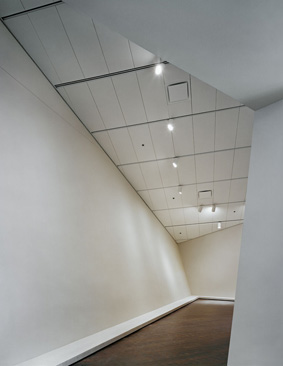
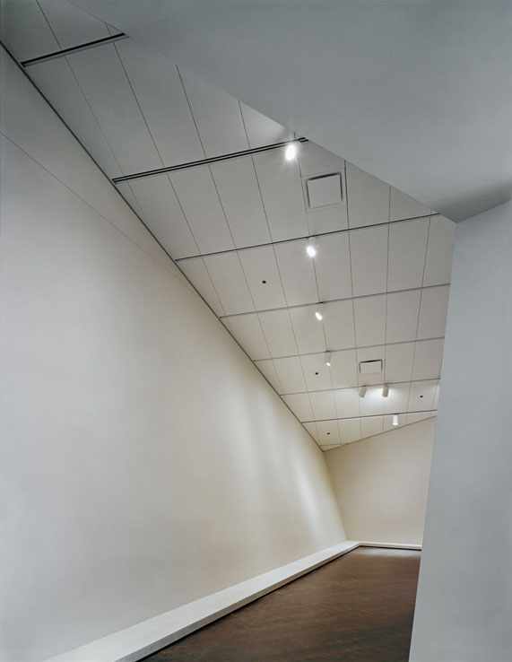
"The galleries have a certain neutrality, but their pointy areas and sloped walls means that they're not conventional places to hang art," says Russell, who has written favorably on the building while also noting its challenges for both curators and "purists" among the museum-going crowd. "It does not naturally enhance the display of art," he explains. Similar challenges have faced curators and art buffs at precedent-breaking new buildings such as the UFO-like Kunsthaus Graz in Austria, the San Francisco Museum of Modern Art, as well as at Frank Gehry's Bilbao and Richard Meier's Getty Center (another space that prominently features Nysan shades).
Libeskind acknowledges the issues raised by his design, and in fact has made this point practically the raison d' être of his Western masterwork. "Museums shouldn't be hospitals for art," Libeskind told Profiles. "Rather than simply proceeding from box to box, the interest stems from creating a synergy between art and architecture, rather than a separation. It's not a challenge to art, but an opportunity for art." This conceptual audacity, combined with Libeskind's energetic focus on resolving every detail - in concert with local architectural associate the Davis Partnership - ensure this point works.
To some degree, the internal layout also reflects his chosen metaphor for the building form: a crystalline rock outcropping that Libeskind saw from his airplane window while passing over the Rocky Mountains. The museum is organized informally, loosely connecting the total area of 53,000 square feet of new exhibit spaces as if by a system of trails. Museum-goers are free to blaze their own path.
As in many new museums, a system of temporary walls determined by the Denver Art Museum's director of design, Dan Kohl, is mounted for exhibits in the eight main galleries. While some hanging works seem confined in this way to relatively small vanilla walls, the sculptures on display benefit from the monumentally angular volumes. Some of the pieces, however, seem relegated to the acute corners of the main volumes. "So you can't really get around them, and they become frontal pieces of art, which I don't think was Libeskind's intention," Russell observes.
Overall, however, many architectural critics including Russell feel the installations work - and will likely get better. "The curators are used to weird architecture," Russell observed in his Bloomberg article on the museum. He reasoned that this is due to the staff's experience with the original 1971 Denver Art Museum by Gio Ponti - connected to the expansion by 100-foot-long footbridge of glass and steel - which he likens to "an Italian medieval fortress imagined by a surrealist." There, the museum's curators have felt a strong creative freedom, mounting exhibitions in a "fairly aggressive" manner.


