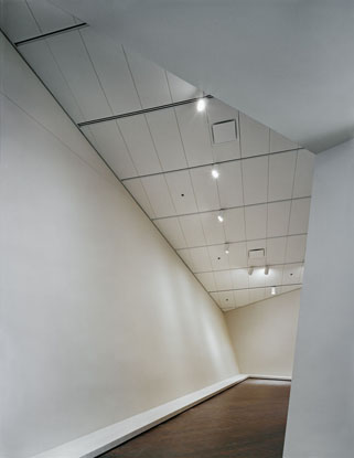
Denver Art Museum
Location:
Denver, Colorado, United States
Architect/Specifier:
Daniel Libeskind / Davis Partnership
Featured Products:
Techstyle® WhiteWhen Daniel Libeskind talks about the signature forms he created for the Denver Art Museum, he is quick to invite everyone inside for a look. The dynamic expression, he emphasizes, is by no means limited to the building envelope.
"This is a museum where what you see on the outside is an expression of what you see on the inside: unprecedented spaces," the New York City - and Berlin-based architect said in an interview last week.
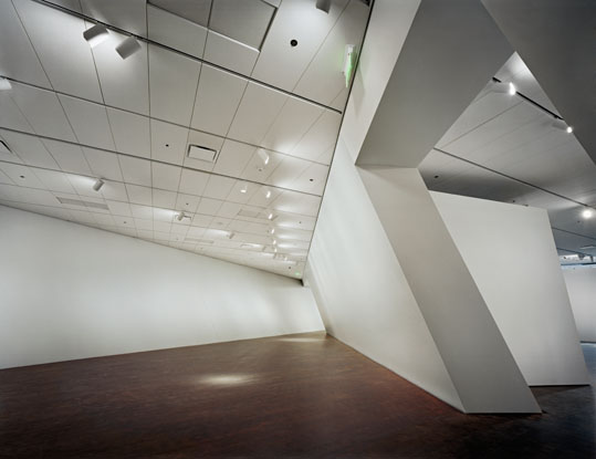
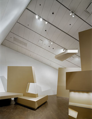
Unprecedented, indeed. For the museum, the addition's sharp edges and precariously tilting titanium-shingle walls enclose 146,000 square feet of dramatically sculptural interiors. The action begins in the lobby atrium, with its giant slanted column and corkscrew stair. Skylights and angled slot windows streak the spaces with light -- many are fitted with custom shades from Hunter Douglas Contract Window Coverings. Novel exhibit displays and big sculptures enhance the architectural theatrics.
While exuberant forms rule here; the palette of interior materials is surprisingly conservative. "The internal space is all the expression of function, there is nothing decorative," Libeskind explains. While the titanium gleams in the sun, inside he worked with only "glass, Colorado stone in the public areas, and flexible ceiling systems."
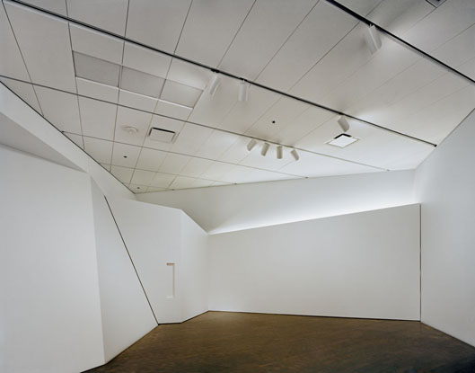
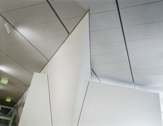
Integrated with reconfigurable track-lighting armatures, the ceilings-Hunter Douglas' Techstyle® acoustical panels-conform tightly to the building's irregular planes. Libeskind originally envisaged a perforated metal ceiling to echo the titanium outside, but ultimately turned to the off-white fabric to soften the interiors a bit...and perhaps the acoustics as well. (The ceilings were also selected for use in the museum residences.) In the gallery spaces, the 2-foot-by-5-foot rectangular panels add a subtle, surprising regularity through their repetition and directionality. Cutting across the ceiling planes are the deeper channels of the lighting tracks, which also happen to be the ceiling's suspension system - a two-for-one approach that reduced installed costs while also minimizing the number of reveals.
The organized and efficient ceiling gesture contrasts markedly from the overall resolution of the daring, $110 million structure. The design rekindles a current debate over whether "architecturally assertive buildings" work well as museums, notes James S. Russell, Bloomberg architecture critic and Architectural Record editor-at large.
"The galleries have a certain neutrality, but their pointy areas and sloped walls means that they're not conventional places to hang art," says Russell, who has written favorably on the building while also noting its challenges for both curators and "purists" among the museum-going crowd. "It does not naturally enhance the display of art," he explains. Similar challenges have faced curators and art buffs at precedent-breaking new buildings such as the UFO-like Kunsthaus Graz in Austria, the San Francisco Museum of Modern Art, as well as at Frank Gehry's Bilbao and Richard Meier's Getty Center.
Libeskind acknowledges the issues raised by his design, and in fact has made this point practically the raison d'etre of his Western masterwork. "Museums shouldn't be hospitals for art" Libeskind told Profiles. "Rather than simply proceeding from box to box, the interest stems from creating a synergy between art and architecture, rather than a separation. It's not a challenge to art, but an opportunity for art." This conceptual audacity, combined with Libeskind's energetic focus on resolving every detail - in concert with local architectural associate the Davis Partnership - ensure this point works.
To some degree, the internal layout also reflects his chosen metaphor for the building form: a crystalline rock outcropping that Libeskind saw from his airplane window while passing over the Rocky Mountains. The museum is organized informally, loosely connecting the total area of 53,000 square feet of new exhibit spaces as if by a system of trails. Museum-goers are free to blaze their own path.
As in many new museums, a system of temporary walls determined by the Denver Art Museum's director of design, Dan Kohl, is mounted for exhibits in the eight main galleries. While some hanging works seem confined in this way to relatively small vanilla walls, the sculptures on display benefit from the monumentally angular volumes. Some of the pieces, however, seem relegated to the acute corners of the main volumes. "So you can't really get around them, and they become frontal pieces of art, which I don't think was Libeskind's intention," Russell observes.
Overall, however, many architectural critics including Russell feel the installations work - and will likely get better. "The curators are used to weird architecture," Russell observed in his Bloomberg article on the museum. He reasoned that this is due to the staff's experience with the original 1971 Denver Art Museum by Gio Ponti - connected to the expansion by 100-foot-long footbridge of glass and steel - which he likens to "an Italian medieval fortress imagined by a surrealist." There, the museum's curators have felt a strong creative freedom, mounting exhibitions in a "fairly aggressive" manner.
What's most intriguing is that Libeskind's product is popular among the local set. The free-form circulation and dynamic installations may explain the museum's broad appeal. "I have met small kids on the site, I've met elderly - people from all walks of life, and many who don't usually go to museums. And they just like being there," says Libeskind.
The larger attraction for the public, however, may be attributed to the powerful effect of the museum on the city as a whole. Using the theatricality of his building and his own design for a five-story loft-condominium facing the museum, Libeskind has transformed this area of Denver into a cultural center. A resulting narrow street and open plazas bring the nearby Colorado History Museum and Michael Graves' 1995 Central Library into what serves as a larger civic ensemble. "The building grows from a dot on the ground into what I attempted to create, a plaza of the arts," says the architect. "It's a new urban setting, a new living room for the city."
To earn this commission, Libeskind won a closely watched competition two years before his Freedom Tower proposal for the World Trade Center site. His deconstructivist scheme won out over quieter designs submitted by Arata Isozaki and Thom Mayne. After he won, he set out on a path that would bump up the volume still more, in the process challenging both the arts elite and city officials to think anew.
To those who have asked him "How was this done in Denver?" the architect responds that the locals' reaction shows architectural activism can work. Libeskind's particular success in Denver can be credited to his accurate sense of how the local community (not to mention his clients) will relate emotionally to his designs. More than a metaphor for the looming Rockies, his titanium-clad museum "is a symbol of 21st-century industries, like the railroad that brought so much to this city in the 19th century," he says. And of the futuristic forms? "It's the pioneering spirit of the American West, inspired by the people who in just a hundred years, created a brand new city."

