- Sector: Culture/Arts
- Location: Denver, Colorado
- Architect/Specifier: Studio Daniel Libeskind with Davis Partnership
- Product(s): Techstyle Acoustical Ceilings, Classic Series, and Nysan Shading


- View details and specifications
- Request product brochure
- Get more case studies via web or email
- Call 800-727-8953 for more info or use our Global Directory

When Daniel Libeskind talks about the signature forms he created for the Denver Art Museum, he is quick to invite everyone inside for a look. The dynamic expression, he emphasizes, is by no means limited to the building envelope.
"This is a museum where what you see on the outside is an expression of what you see on the inside: unprecedented spaces," the New York City- and Berlin-based architect said in an interview last week.
Unprecedented, indeed. For the museum, the addition's sharp edges and precariously tilting titanium-shingle walls enclose 146,000 square feet of dramatically sculptural interiors. The action begins in the lobby atrium, with its giant slanted column and corkscrew stair. Skylights and angled slot windows streak the spaces with light -- many are fitted with custom Nysan shades from Hunter Douglas. Novel exhibit displays and big sculptures enhance the architectural theatrics.
While exuberant forms rule here; the palette of interior materials is surprisingly conservative. "The internal space is all the expression of function, there is nothing decorative," Libeskind explains. While the titanium gleams in the sun, inside he worked with only "glass, Colorado stone in the public areas, and flexible ceiling systems."
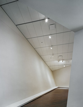
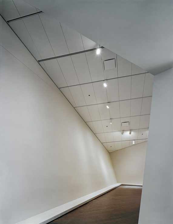
Integrated with reconfigurable track-lighting armatures, the ceilings - Hunter Douglas' Techstyle acoustical panels - conform tightly to the building's irregular planes. Libeskind originally envisaged a perforated metal ceiling to echo the titanium outside, but ultimately turned to the off-white fabric to soften the interiors a bit... and perhaps the acoustics as well. (The ceilings were also selected for use in the museum residences.) In the gallery spaces, the 2-foot-by-5-foot rectangular panels add a subtle, surprising regularity through their repetition and directionality. Cutting across the ceiling planes are the deeper channels of the lighting tracks, which also happen to be the ceiling's suspension system - a two-for-one approach that reduced installed costs while also minimizing the number of reveals.
The organized and efficient ceiling gesture contrasts markedly from the overall resolution of the daring, $110 million structure. The design rekindles a current debate over whether "architecturally assertive buildings" work well as museums, notes James S. Russell, Bloomberg architecture critic and Architectural Record editor-at large.


