Croma Restaurant
Location:
Prestwick, Manchester, , United Kingdom
Architect/Specifier:
Ombler Iwanowski Architects
The new mixed-use Radius development in the Prestwich area of Manchester, U.K., presented the ideal backdrop for the latest outpost of a trendy, native-born restaurant group called Croma. The restaurateur saw the space as a highly visible anchor for the 45 million Euro, mixed-use town center building. The architect saw that, too, but even more: It could be the perfect "signature space," with 900 square meter in a cavernous double-height volume with large perimeter windows - roomy and bright enough to add a sweeping mezzanine level.
"Croma places an emphasis on design," says architect Griff Evans of local architecture firm Ombler Iwanowski Architects. "Their food is not that expensive, but their restaurants make you feel glamorous."
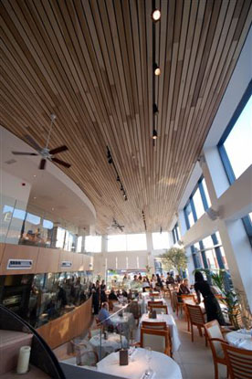
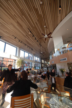
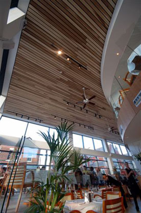
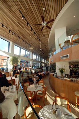
Using careful, minimalist detailing in a decidedly contemporary combination of woods and earthy tones, the architecture offsets the crisp white linens and walls that mark the space. The glass-railed mezzanine level, a band of wood-hued panels, neatly divides the space and is highly visible from outside through large floor-to-ceiling windows. To enhance Croma's brand and sensibility, Evans specified a breathtaking Solid Linear Wood Ceiling System by Hunter Douglas Architectural Products, finished in American poplar. Running the full length of the main dining area, the slatted wood ceiling contribute to a memorable image while also receding visually, picking up hints of the wood chairs and bar below.
"Selecting the Solid Linear Wood Ceiling System was key. It was the only system or solution where we could have full control over the quality of it, rather than just asking a contractor to knock up a wood ceiling that would eventually warp," says Evans. "The acoustic function of it, and the random effect of the American poplar finish - mixing dark planks and lighter planks - works quite well. We even hung lighting tracks in it and pulled them away from the ceiling so you perceive the ceiling plane as one continuous piece of wood, which then reflects where it touches the full wall of mirror."
Elsewhere, Evans took care to match other details, such as the curved MDF panels with wood veneer on the mezzanine, whose joints all line up with the breaks in the glass guardrail above, measuring out the space nicely. Below, the wood partition and bar serves as a kitchen screen, with bronzed glass that creates a semitransparent relationship between the kitchen and dining area, so that diners may see the activity within.
Evans explains that Croma's design image is no accident. Named for a famous Manchester restaurant of the 1920s, Croma built upon the historic image by merging classic hospitality elements with cutting-edge materials and crisp lines. Their successful run started with a design concept by the Italian artist Enzo Apicella. In which he focused "on an inspired use of light and space, while allowing for a unique feel for each new establishment." Apicella's idea was to incorporate wood accents and white backdrops, but also to incorporate each location's unique architectural features. The 80-plus-year-old designer created the concept for the Prestwich Croma in a collaboration with Ombler Iwanowski.
With an earlier Apicella concept, Croma's first location hit the scene in December 2000 in a formerly derelict building, establishing a bright and spacious feel over three open-plan levels, and critics applauded its "contemporary Art Deco feel." Later, Croma Chorlton was planned for a refurbished red-brick building with a south-facing curved facade. Apicella instilled a somewhat rustic style in the main spaces, while transitioning to a contemporary glass conservatory at the rear, overlooking an Italian-inspired courtyard, delicately planted and illuminated.
With Prestwich, Evans led his design team at Ombler Iwanowski to create a thoroughly contemporary interior from the ground up, in a fully customized space. The curve of the mezzanine would recall the memorable Chorlton location. Otherwise, it was totally new: Its cool lines tempered by the wood finishes of the wall panels, furnishings and the Hunter Douglas linear ceiling, says Evans.
The acoustical performance of the ceiling was another plus, Evans notes, considering the mostly hard surfaces and finishes gracing the large, open volume. So was its light wood finish: the windows, with crown-height beams separating storefront from clerestory glass, bathe the space in plentiful light. Increasing the openness are hip-height glass guardrails separating dining areas of different heights: an upper and lower area on the main floor, and the mezzanine under a painted gypsum soffit above. Overhead, the timber-hued bands of Hunter Douglas' linear system pick up the palette of wood chairs and architectural elements below.
"We were really impressed with the quality of the design and the fantastic location, which seemed to suit our needs exactly," said Kirsty Marshall, the owner-manager of Croma, noting that it reinforces the company's "reputation for good quality food, design and service.""We believe that Croma's stylish restaurant format will compliment the Radius development scheme extremely well," adds Martyn Markland, a director with the developer and agent Atisreal.


