National Ballet School of Canada
Location:
Toronto, , Canada
Architect/Specifier:
KPMB, Toronto
By Chris Sullivan
Like architecture, ballet is a demanding art form. Mastery of a rigorous, established repertoire is a crucial prerequisite for expression -- and innovation.
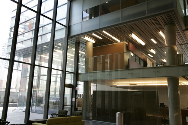
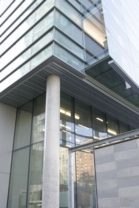
Capturing this spirit in ways both grand and subtle, a new campus for Canada's National Ballet School in Toronto effectively melds heritage with modern elegance on a tight site... and a modest budget. At the urban scale, the project centers on Northfield, a Georgian-style house built for statesman Sir Oliver Mowat in 1856. Weaving around the brick pavilion is a U-shaped complex of delicately detailed glass-and-steel volumes on recessed bases, rising up to five stories yet deferring to the streetscape and views of their venerable brick neighbor. Hidden behind, a gently sloped bridge links their internal programs, totaling 180,000 square feet, at a three-story, socializing atrium. Like the long history of ballet, Northfield stands as the symbolic heart of the campus -- a firm pledge to tradition. Just as apt, however, are the clean-edged, transparent volumes that give the old house its up-to-the-minute embrace: After all, the school's academic program covers the best in contemporary ballet, too.
In ways both literal and abstract, the new structures allude to the rhythms and movement of dance. Conceived by Toronto's Kuwabara Payne McKenna Blumberg (KPMB) in a joint venture with coordinating architect Goldsmith, Borgal & Co., the design takes basic building materials -- stone block, curtain wall, metal ceilings -- and makes them boogie. "Most literal is the ceramic fritting of a choregraphic notation system, similar to written music, on a sculptural glass screen for a prominent main facade." But as in choreographing ballet, KPMB's real feats emerge from the reinterpretation and elevation of a few standard moves.
A wall of ground-face masonry cladding, for example, mixes blocks in three harmonious hues, drawing the eye along seemingly random paths of the resulting pattern. (Not trivially, the colors also help obscure the blotching commonly seen in such large walls.)
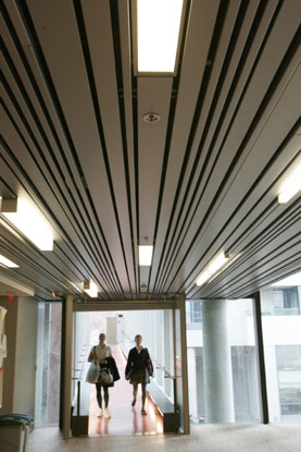
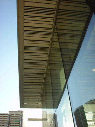
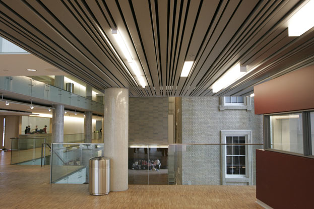
To a similarly graceful, kinetic effect is the clever detailing of a tried-and-true metal ceiling system. In fact, the suspended linear "Deep Box" by Hunter Douglas Contract is familiar to anyone who's been in Toronto's subway stations: Its striated appearance comes from roll-formed metal profiles, typically deployed with a single-panel width, reveal dimension, and color. But the project design architect, Mitchell Hall, envisaged a less orthodox application of the decades-old, low-cost panel system. Hall created a repeating pattern mixing 2-inch, 4-inch, and 6-inch panels, all hung as typical from a common carrier suspension system. In the reveals, three distinct types of light fixtures are sprinkled, seemingly by chance: a 6-inch-wide flush lens, and two narrower, protruding rectangles of different lengths, all in white acrylic. At the perimeter, the linear aluminum appears to extend right through the curtain wall, continuing as soffit outside.
The creative solution, flawlessly executed by subcontractor Downsview Drywall, morphed into a signature element of studios and 20-foot-high public spaces. Yet the ceilings cost less than the original idea, a stretched PVC fabric that's more difficult to maintain and could not extend outdoors. And while Hall could have customized the ceiling system, he didn't need to. "There was more than enough that I could do with it," he explains.
Just as great ballet is the result of so many basic maneuvers, adroitly combined and skillfully executed, so is KPMB's use of time-honored building approaches in unexpected and evocative ways. "Good design is about rethinking and reinterpreting traditional modes of construction," says Hall. "And that often comes out of an architect's creative solution using inexpensive, simple materials."
-Chris Sullivan is a writer and former editor of Architecture magazine.

